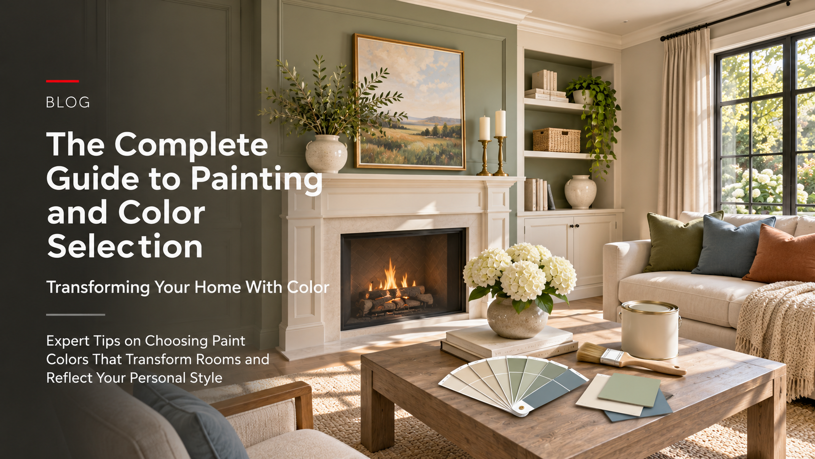
Expert Tips on Choosing Paint Colors That Transform Rooms and Reflect Your Personal Style
Paint is one of the most powerful tools in home design. A fresh coat of paint can completely transform a room, creating a new mood, updating an outdated aesthetic, or reflecting your personal style. Yet many Kansas City homeowners feel overwhelmed by color choices. They stand in paint aisles staring at hundreds of colors, unable to decide. They choose colors impulsively and regret them weeks later. They worry their color choices will date quickly or clash with their home’s overall aesthetic.
Poor paint color choices create long-term frustration. Colors that seemed perfect on a small swatch look completely different on an entire wall. Colors you chose with excitement become sources of stress living with them daily. Clashing colors throughout your home create visual discord. Colors that felt trendy become dated quickly. The space doesn’t feel like home because the colors don’t support how you actually want to feel.
But when you choose paint colors thoughtfully, they transform everything. The right color makes a small room feel spacious. A calming color in a bedroom supports better sleep. A bold accent wall creates visual interest without overwhelming. Coordinated colors throughout your home create visual flow and cohesion. Your home feels intentional, beautiful, and perfectly suited to your lifestyle.
Yet most Kansas City homeowners don’t realize how much strategy goes into successful color selection. They don’t understand how lighting affects how colors appear. They don’t know how to coordinate colors across rooms. They don’t recognize how undertones determine whether colors work together. They underestimate how much preparation and technique affect paint quality.
The truth: Strategic paint color selection, combined with proper preparation and quality painting, is one of the highest-impact, most cost-effective home improvements you can make. A skilled painter using quality materials creates finishes that last years. Thoughtfully chosen colors transform spaces and create homes you love living in.
At All-Pro Renovations, we’ve painted hundreds of Kansas City homes — from single rooms to complete interior refreshes throughout the metro area: Overland Park, Olathe, Lee’s Summit, Shawnee, Lenexa, Liberty, and beyond. We understand color psychology, how light affects color perception, and how to choose colors that work beautifully. We execute painting projects with precision, preparing surfaces properly and applying quality paint to create finishes that last.
In this comprehensive guide, we’ll walk you through everything involved in selecting paint colors and executing a painting project — so you can transform your home with colors that reflect your style and create the spaces you love.
🎯 Understanding Paint and Color: The Foundation
Successful painting starts with understanding paint types, how colors work, and how to select colors that work for your specific spaces.
Paint Types and Finishes
Interior Paint Categories
Latex (Water-Based) Paint
- Water-soluble, easy cleanup
- Low odor and VOC (volatile organic compounds)
- Dries quickly (approximately 1-2 hours)
- Flexible finish resists cracking
- Environmental advantages
- Most popular for interior use
Oil-Based (Alkyd) Paint
- Solvent-based, requires mineral spirits cleanup
- Higher VOC emissions
- Longer drying time (approximately 6-8 hours)
- Harder, more durable finish
- Better adhesion to glossy surfaces
- Less common but preferred for some applications
Paint Finishes
Flat/Matte
- No shine or reflectivity
- Hides wall imperfections
- Shows fingerprints and stains easily
- Difficult to clean
- Best for: ceilings, low-traffic areas
- Most forgiving finish
Eggshell
- Slight sheen (approximately 5-10% reflection)
- Balances washability and hiding imperfections
- Subtle appearance
- Easy to clean
- Best for: living rooms, bedrooms
- Good all-purpose choice
Satin
- Moderate sheen (approximately 25-35% reflection)
- Wipeable and cleanable
- Shows wall imperfections slightly
- Elegant appearance
- Best for: kitchens, bathrooms, trim
- Good for moisture areas
Semi-Gloss
- Noticeable sheen (approximately 60-85% reflection)
- Very durable and washable
- Shows wall imperfections clearly
- High-traffic durability
- Best for: trim, doors, kitchens, bathrooms
- Professional appearance
Gloss
- High shine (approximately 85%+ reflection)
- Most durable and washable
- Shows every imperfection
- Contemporary or bold aesthetic
- Best for: doors, cabinets, special features
- Premium appearance
Understanding Color and Undertones
Color Temperature
Warm Colors
- Reds, oranges, yellows
- Creates cozy, inviting atmosphere
- Stimulates energy and appetite
- Advances visually (makes rooms feel smaller)
- Works for gathering spaces
- Creates intimate feeling
Cool Colors
- Blues, greens, purples
- Creates calm, peaceful atmosphere
- Supports relaxation and focus
- Recedes visually (makes rooms feel larger)
- Works for bedrooms and offices
- Creates serene feeling
Neutral Colors
- Whites, grays, beiges, browns
- Versatile and timeless
- Works with any décor style
- Affects how other colors appear
- Provides calm backdrop
- Increasingly popular choice
Undertones Matter
Finding Undertones
- Pink undertones: slightly warm, flattering
- Yellow undertones: warm, cozy
- Blue undertones: cool, sophisticated
- Gray undertones: neutral, sophisticated
- Red undertones: warm, energetic
Undertone Significance
- Determines if color harmonizes with adjacent colors
- Affects how color appears at different times of day
- Impacts coordination across rooms
- Changes perception of color intensity
- Critical to successful color matching
Identifying Undertones
- Compare paint swatches on white paper
- Observe at different times of day
- Notice warm or cool cast
- Compare to known undertone colors
- Test on walls before committing
🌈 Color Selection Process: From Vision to Reality
Selecting paint colors requires systematic thinking, testing, and consideration of multiple factors.
Assessing Your Space and Lighting
Natural Light
- North-facing rooms: cool light, cool colors look best
- South-facing rooms: warm light, warm colors work well
- East-facing rooms: bright morning light
- West-facing rooms: warm afternoon/evening light
- Changes throughout day and seasons
Artificial Light
- Warm LED bulbs (2700K): warm colors look better
- Cool LED bulbs (4000K): cool colors look better
- Incandescent: warm, yellowish light
- Fluorescent: can make colors appear gray
- Bulb type affects color perception
Room Function
- Gathering spaces: stimulating or inviting colors
- Bedrooms: calming colors
- Home offices: focus-supporting colors
- Bathrooms: moisture-resistant finishes, bright colors
- Kitchens: appetizing or energizing colors
Color Selection Strategies
Color Wheel Approach
Complementary Colors
- Opposite on color wheel
- Creates visual contrast
- High energy and interest
- Requires careful balance
- Bold, dramatic choices
Analogous Colors
- Adjacent on color wheel
- Creates harmony and flow
- Soothing, pleasing
- Easy to coordinate
- Sophisticated appearance
Monochromatic
- Different tints and shades of same color
- Creates continuity
- Calm and cohesive
- Varying depth adds interest
- Timeless approach
Triadic
- Three colors equally spaced on wheel
- Balanced visual interest
- Complex to execute
- Professional results require expertise
- Distinctive, intentional appearance
Testing Colors Before Committing
Paint Samples
- Purchase sample sizes of potential colors
- Apply to actual walls in room
- Observe at different times of day
- Live with color for several days
- See how natural and artificial light affect it
Observation Points
- North wall: cool light exposure
- South wall: warm light exposure
- Morning light: changes perception
- Evening light: different appearance
- Artificial light: evening appearance
Multiple Samples
- Test 3-5 potential colors
- Compare side by side
- Observe preferences evolving
- Narrow down final choice
- Confidence in decision increases
Coordination Across Rooms
Creating Visual Flow
- Coordinate colors throughout open spaces
- Transition colors between rooms subtly
- Maintain undertone consistency
- Create intentional variations
- Professional designer guidance helps
Trim and Architectural Details
- Paint trim same color as walls (modern)
- White or cream trim (traditional)
- Darker trim (dramatic, sophisticated)
- Coordinate trim throughout home
- Creates visual continuity
Bold Accent Colors
- Paint one wall different color
- Creates focal point and visual interest
- Choose wall with architectural interest
- Complement other colors
- Requires careful color selection
🎨 Color Recommendations by Room
Different rooms benefit from different color approaches based on their function and light exposure.
Bedroom Colors
Calming Color Palette
- Soft blues: peaceful, sleep-supporting
- Soft greens: natural, soothing
- Warm neutrals: comfortable, inviting
- Soft purples: elegant, relaxing
- Pale pinks: gentle, soft
Colors to Avoid
- Bright red: stimulating, energizing
- Bold orange: activating, exciting
- Bright yellow: can feel harsh
- High-saturation colors: overstimulating
- Dark colors: can feel cave-like
Lighting Consideration
- Natural light: all cool colors work
- Limited natural light: avoid dark colors
- Warm artificial light: cool colors balance it
- Test colors in evening light
Living Room and Gathering Spaces
Inviting Color Palette
- Warm neutrals: comfortable, welcoming
- Soft warm colors: cozy, inviting
- Earth tones: grounded, sophisticated
- Accent colors: visual interest, personality
- Balance warm and cool
Color Strategy
- Main color: calm, background
- Accent color: personality, focal point
- Trim and details: coordination or contrast
- Lighting: warm light enhances warmth
Kitchen Colors
Appetizing and Energizing
- Warm colors: stimulate appetite
- Creams and whites: clean, bright
- Soft yellows: warm, inviting
- Warm grays: contemporary, sophisticated
- Green accents: fresh, natural
Practical Considerations
- Easy-clean finish (satin or semi-gloss)
- Hides cooking stains and marks
- Balanced between bright and intimate
- Coordinates with cabinetry
- Professional appearance
Bathroom Colors
Fresh and Clean
- Whites and creams: clean, bright
- Soft blues: spa-like, calming
- Soft greens: fresh, natural
- Pale grays: sophisticated, clean
- Light colors maximize perceived space
Practical Considerations
- Moisture-resistant paint (semi-gloss or satin)
- Ventilation critical for paint durability
- Small spaces benefit from light colors
- Mold-resistant formulas available
- Consider humidity exposure
Home Office Colors
Focus and Productivity
- Soft blues: concentration support
- Soft greens: focus, natural connection
- Warm neutrals: comfortable, professional
- Avoid overstimulating colors
- Support focus and creativity
Professional Appearance
- Neutral backgrounds for video calls
- Coordinates with furniture
- Supports professional image
- Calming without being boring
- Balance function and personality
🖌️ Preparation: The Foundation of Quality Painting
Proper surface preparation determines whether paint looks professional and lasts years. Rushing preparation leads to poor results.
Surface Preparation Steps
Cleaning
- Remove dust and cobwebs
- Wash greasy or grimy surfaces
- Allow surfaces to dry completely
- Clean prevents paint adhesion failure
- Critical first step
Repairs
- Fill cracks and holes
- Sand putty smooth
- Replace damaged drywall
- Repair water damage
- Caulk gaps and seams
Sanding
- Sand glossy surfaces for adhesion
- Sand between coats
- Sand rough areas smooth
- Provides proper surface texture
- Critical for paint adhesion
Priming
- Use primer on new drywall
- Prime dark colors before light paint
- Prime stains and water damage
- Prime glossy surfaces
- Improves coverage and adhesion
Taping and Protection
- Tape trim and baseboards
- Protect floors and furniture
- Professional appearance result
- Time-intensive but worth it
- Prevents paint splatter and drips
Professional vs. DIY Painting
Professional Painters
- Proper preparation expertise
- Quality equipment and technique
- Consistent, professional finish
- Time-efficient execution
- Warranty on workmanship
DIY Painting
- Cost savings on labor
- Personal control over project
- Mistakes common and expensive
- Time-intensive process
- Quality depends on skill
Hybrid Approach
- Professional preparation
- DIY painting
- Balances cost and quality
- Professional prep essential
- Painting simpler than prep
💡 Lighting and Color Perception
Understanding how lighting affects color perception is essential to color selection success.
Natural Light Effects
Color Shifts by Time of Day
- Morning light: cool, bright
- Midday light: neutral, balanced
- Afternoon light: warm, golden
- Evening light: warm, orange tones
- Night: artificial light dominates
Seasonal Light Changes
- Summer: bright, neutral light
- Winter: warm, low-angle light
- Spring/Fall: transitional light
- Affects color perception year-round
- Choose colors handling seasonal shifts
Artificial Light Effects
Warm Light (2700K)
- Yellowish, cozy light
- Enhances warm colors
- Makes cool colors appear dull
- Intimate, comfortable feel
- Common in homes
Neutral Light (4000K)
- Balanced appearance
- Neither warm nor cool cast
- Most accurate color representation
- Professional appearance
- Less common in homes
Cool Light (5000K+)
- Bluish, bright light
- Enhances cool colors
- Makes warm colors appear orange
- Clinical, energetic feel
- Rarely used in homes
Mixed Lighting Considerations
Day and Night Appearance
- Test colors in both conditions
- Colors appear different with different light
- Lighting affects mood and feel
- Choose colors that work in both conditions
- Evening light particularly important
💰 Cost Breakdown for Kansas City Homeowners
Painting costs vary based on room size, surface condition, and preparation needed.
Interior Painting Costs
Small Room (Approximately 150 sq ft)
- Surface preparation: approximately $200-400
- Primer (if needed): approximately $100-150
- Paint: approximately $150-250
- Labor: approximately $400-700
- Materials and supplies: approximately $100-150
- Total: approximately $950-1,650
Medium Room (Approximately 300-400 sq ft)
- Surface preparation: approximately $400-700
- Primer (if needed): approximately $150-250
- Paint: approximately $250-400
- Labor: approximately $800-1,400
- Materials and supplies: approximately $150-250
- Total: approximately $1,750-3,000
Large Space (Approximately 600+ sq ft)
- Surface preparation: approximately $600-1,200
- Primer (if needed): approximately $250-400
- Paint: approximately $400-700
- Labor: approximately $1,200-2,400
- Materials and supplies: approximately $200-400
- Total: approximately $2,650-5,100
Factors Affecting Cost
Surface Condition
- Clean, smooth walls: lower cost
- Damaged, rough walls: higher cost
- Repairs needed: additional cost
- Water damage: significant additional cost
Paint Quality
- Budget paint: lower cost, poor durability
- Mid-range paint: good balance
- Premium paint: higher cost, superior durability
- Specialty paints: additional cost
Color and Preparation
- Light to light: minimal primer
- Dark to light: primer required
- Multiple colors: higher labor cost
- Accent walls: additional time
⏱️ Timeline for Painting Projects
Painting timelines vary based on scope and preparation needed.
Single Room Painting
- Surface preparation: 1-2 days
- Priming: 1/2-1 day
- First coat: 1/2-1 day
- Second coat: 1/2-1 day
- Cleanup and touch-up: 1/2-1 day
- Total: 3-6 days
Multiple Rooms (3-4 Rooms)
- Surface preparation: 2-4 days
- Priming: 1-2 days
- First coat: 1-2 days
- Second coat: 1-2 days
- Trim and finishing: 1-2 days
- Total: 6-12 days
Full Interior Painting
- Planning and color selection: 1-2 weeks
- Surface preparation: 3-5 days
- Priming: 1-2 days
- First coat: 2-3 days
- Second coat: 2-3 days
- Trim and finishing: 2-3 days
- Total: 10-20 days plus planning
❌ Common Painting Mistakes to Avoid
Mistake 1: Inadequate Surface Preparation
The Problem: Paint applied to dirty, glossy, or damaged surfaces doesn’t adhere properly. Paint peels or flakes within months. Results look unprofessional and deteriorate quickly.
The Solution: Invest time and effort in surface preparation. Clean thoroughly. Sand glossy surfaces. Fill holes and cracks. Prime properly. Professional preparation is approximately 40% of quality painting.
Mistake 2: Choosing Color Without Testing
The Problem: Color that looked perfect on a small swatch looks completely different on an entire wall. Living with a color you regret creates long-term frustration.
The Solution: Always test colors on actual walls. Observe at different times of day. Live with color for several days before committing. Test in both natural and artificial light.
Mistake 3: Skipping Primer
The Problem: Paint requires primer on porous surfaces (new drywall), stains, water damage, and glossy surfaces. Skipping primer leads to poor adhesion and coverage requiring multiple coats.
The Solution: Use appropriate primer for your situation. New drywall requires primer. Stains require blocking primer. Glossy surfaces require adhesion primer. Quality primer saves paint and ensures durability.
Mistake 4: Using Low-Quality Paint
The Problem: Budget paint contains lower pigment levels and binders. Results in poor color quality, requires multiple coats, and deteriorates quickly. False economy.
The Solution: Use mid-range to premium paint for quality results. Superior paint covers better, lasts longer, and provides better appearance. Worth the additional cost.
Mistake 5: Choosing Color Based Only on Personal Preference
The Problem: While personal taste matters, color selection should also consider lighting, room function, and coordination. Colors chosen purely on preference often clash or don’t support the room’s purpose.
The Solution: Balance personal preference with strategic color selection. Consider lighting, room function, and coordination. Professional color consultation helps navigate complexity.
Mistake 6: Painting Without Protecting Surfaces
The Problem: Splatter and drips on floors, furniture, and trim create additional cleanup work and potential damage. Unprofessional appearance.
The Solution: Use drop cloths and protective coverings. Tape carefully. Professional painters protect all surfaces. Worth the time investment for clean results.
Mistake 7: Rushing Between Coats
The Problem: Paint not fully dry before applying second coat creates adhesion problems and uneven appearance. Multiple coats may be needed to achieve proper coverage.
The Solution: Follow manufacturer’s drying time recommendations. Typically approximately 4-6 hours between latex coats, longer for oil-based. Proper drying ensures quality results.
❓ Frequently Asked Questions About Painting and Color
Q: How do I choose between warm and cool colors? A: Consider room function and lighting. Warm colors for gathering spaces and warm-light rooms. Cool colors for bedrooms and offices. Also consider personal preference and coordination with adjacent rooms.
Q: Should trim be white or match walls? A: Both options work. White trim is traditional and creates contrast. Matching trim is modern and creates continuity. Choose based on personal preference and home style.
Q: How many coats of paint do I need? A: Typically two coats for adequate coverage. One coat rarely provides full opacity and durability. Primer counts as first coat if needed. Quality paint sometimes requires one coat; budget paint often needs three.
Q: What’s the best paint finish for different rooms? A: Bedrooms and living rooms: eggshell or satin. Kitchens and bathrooms: satin or semi-gloss (moisture resistance). Trim: semi-gloss or gloss (durability). Ceilings: flat (hides imperfections).
Q: How do I paint an accent wall effectively? A: Choose wall with architectural interest or opposite entry. Coordinate color with rest of room. Tape carefully for clean lines. Darker accent walls advance visually; lighter walls recede.
Q: Can I paint over existing paint? A: Yes, if surface is clean and sound. Sand glossy paint. Prime stains and dark colors. Poor adhesion if not properly prepared.
Q: How long does interior painting typically last? A: Approximately 5-7 years in normal conditions. Approximately 3-5 years in high-moisture areas. Approximately 7-10 years with premium paint. Professional application extends durability.
Q: What’s the difference between flat and eggshell finish? A: Flat: no shine, hides imperfections, difficult to clean. Eggshell: slight sheen, easier to clean, shows minor imperfections. Eggshell is better all-purpose choice.
Q: Should I hire a professional painter? A: Professional painters provide expertise, quality results, and time savings. Worth cost for multiple rooms or complex projects. DIY acceptable for single rooms if you have time and skill.
Q: How do I coordinate paint colors across rooms? A: Maintain undertone consistency. Use analogous colors (adjacent on color wheel). Create subtle transitions between spaces. Professional color consultation helps navigate complexity.
🎯 The Bottom Line
Paint is one of the most powerful and cost-effective tools for transforming your home. Choosing colors strategically and executing painting with quality techniques creates spaces you love living in.
Successful painting requires:
✓ Strategic color selection based on lighting and room function ✓ Testing colors before committing to full room ✓ Thorough surface preparation (40% of quality) ✓ Appropriate primer for your situation ✓ Quality paint and professional technique ✓ Proper drying time between coats ✓ Coordination across spaces for visual flow
The most expensive painting is the one that requires repainting after poor results. The best investment is thoughtful color selection combined with proper preparation and quality execution.
At All-Pro Renovations, we’ve painted hundreds of Kansas City homes, transforming spaces with strategic color selection and professional painting technique. We understand color psychology, how lighting affects perception, and how to execute painting projects that last years. Whether refreshing single rooms or completing full interior refreshes, we deliver quality results.
Ready to transform your home with color? Let’s discuss your vision, assess your lighting, and select colors that work beautifully for your spaces.
Contact All-Pro Renovations today for your free painting consultation: 📞 913-354-2380 💻 Get Your Free Painting Estimate
Our team is ready to help you select the perfect colors and execute painting projects that transform your home. From color consultation to professional painting, we handle every aspect of your project with expertise and commitment to creating spaces you’ll love.
All-Pro Renovations serves Kansas City homeowners with expert renovation guidance. From planning to completion, we’re committed to delivering quality results that exceed expectations.
Posted in Construction, Design, Exteriors, Kitchen & Bath, Property Investment, Remodeling